Designing for mobile: optimizing your amazon listings for smartphone users
Did you know that in 2023, the Amazon mobile shopping app will be the most downloaded in the World? In recent years, Amazon has nailed mobile commerce, generating an unprecedented degree of confidence among consumers who like to shop on the go.
And, while Amazon’s mobile sales are still dominated by its desktop sales, there’s little doubt that they’re picking up the pace slowly but surely. If you don’t adjust to this change as a seller, you risk falling behind.
Optimizing your Amazon design for mobile users is essential for providing a seamless and enjoyable shopping experience for the growing number of consumers who use their smartphones to browse and purchase products online. In this blog post, we will discuss some of the key considerations and best practices for optimizing your Amazon design for mobile users, including layout, navigation, and product images.
Amazon mobile Layout:
One of the most important considerations for optimizing your Amazon design for mobile users is the layout of your pages. Mobile screens are typically smaller than desktop screens, so it’s important to use a layout that makes it easy for users to find the information they need, without having to scroll or zoom in. This means keeping your layout simple and uncluttered, with plenty of white space around elements such as text and images.
It’s also important to use a responsive design, which automatically adapts to the size of the user’s screen. This ensures that your pages look good and function properly on a variety of different devices, from smartphones to tablets.
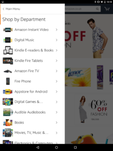
The layout of the Amazon mobile app is designed to be user-friendly and easy to navigate. The homepage displays featured products and popular categories, making it easy for users to find what they’re looking for. The top of the screen features a search bar, allowing users to quickly search for specific products or categories.
The navigation menu, located at the bottom of the screen, includes options such as “Home,” “Shop,” “Cart,” “Orders,” and “Account.” The “Shop” option allows users to browse by department or category, and the “Cart” option allows users to view and edit their current shopping cart. The “Orders” option allows users to view their past and current orders, and the “Account” option allows users to manage their account settings and view their order history.
The product page layout is clear, with high-resolution images, product details, and customer reviews prominently displayed. Users can also see related products and frequently bought together items. Additionally, users can easily add items to their cart and proceed to checkout from the product page.
The checkout process is streamlined and efficient, with clear instructions on each step. Users can choose their shipping method and enter their payment information, and they can also view a summary of their order before submitting it.
Overall, the Amazon mobile app’s layout is intuitive, making it easy for users to find and purchase the products they’re looking for. The layout is optimized to work with mobile devices and it’s a great way to shop on the go.

Navigation:
Another important consideration for optimizing your Amazon design for mobile users is navigation. On mobile devices, users typically have smaller screens and less real estate to work with, so it’s important to make it easy for them to find the information they need. This means keeping your navigation simple and intuitive, with large, easy-to-tap buttons and links.
A search bar is also essential for mobile users, as it allows them to quickly find the products they are looking for. It should be prominently displayed at the top of the page and be easy to use.
Product Images:
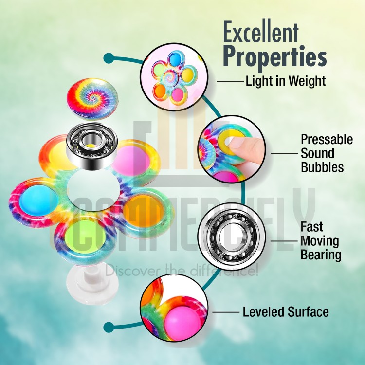
Product images are an important aspect of any e-commerce site, and this is especially true for Amazon, which is known for its large selection of products. When optimizing your Amazon design for mobile users, it’s important to ensure that your product images are high-quality, clear, and easy to view. This means using large, high-resolution images that are optimized for mobile devices, and that can be zoomed in to see more detail.
It’s also important to include multiple images of each product so that users can get a better sense of what they’re looking at. This includes images of the product from different angles and images of the product in use.
In conclusion, optimizing your Amazon design for mobile users is essential for providing a seamless and enjoyable shopping experience for the growing number of consumers who use their smartphones to browse and purchase products online. By keeping your layout simple and uncluttered, making navigation simple and intuitive, and using high-quality, clear product images, you can ensure that your Amazon design is mobile-friendly and user-friendly.
Brand story and Product Description of the amazon mobile app:
Incorporating your brand story early in the product description on the Amazon mobile app can help to establish a connection with potential customers and set your product apart from competitors. By highlighting the unique features, benefits, and values of your brand, you can create a compelling narrative that resonates with your target audience and strengthens their emotional connection to your product.
One way to do this is by starting the product description with a strong headline that captures the essence of your brand story. This could be a statement about the unique features of your product, the benefits it offers, or the values that drive your company. For example, if your brand is focused on sustainability, you could start the product description with a statement like “Eco-friendly and made with natural ingredients” which highlights the sustainable aspect of your brand.
Additionally, you can use storytelling techniques throughout the product description to bring your brand story to life. This could include incorporating customer testimonials, sharing the inspiration behind the product, or highlighting the unique craftsmanship or materials used in the product’s creation.
Why Amazon Mobile Optimization is Important in 2023:
Amazon Mobile Optimization is important in 2023 because mobile devices have become the primary way that consumers access the internet. As of 2021, over half of all internet traffic comes from mobile devices and this trend is expected to continue to rise in the coming years. Furthermore, the use of smartphones and tablets to purchase online has grown exponentially, making it more important than ever for businesses to optimize their online presence for mobile users.
Optimizing for mobile devices ensures that customers can easily navigate and access the information they need on your Amazon store, making it more likely that they will make a purchase. A mobile-optimized Amazon store will have a responsive design, making it easy to read and navigate on any device. In addition, mobile optimization can improve website loading times, which can lead to increased customer satisfaction and higher conversion rates.

Failing to optimize for mobile devices can lead to a poor user experience and can result in customers leaving your site without making a purchase. Therefore, businesses must prioritize mobile optimization to stay competitive and meet the needs of their customers.
In short, Amazon Mobile Optimization is important in 2023 because a large portion of internet traffic and e-commerce sales are coming from mobile devices, and providing a seamless mobile experience can lead to increased customer satisfaction, conversion rates, and sales.