Impact of visual hierarchy on amazon designs
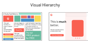
Visual hierarchy in design is the arrangement of elements in a way that conveys order or importance. It can help your audience determine what is most important and guide their attention through the design. This can be done through the use of color, size, shape, space, contrast, and other design elements. By using visual hierarchy, you can create a design that is both visually appealing and easy to understand.
What are the effects of using visual hierarchy in designing?
visual hierarchy is a powerful tool for designing effective and user-friendly interfaces and can be used to achieve a wide range of goals, from improving usability to increasing conversions.
Improved usability:
Visual hierarchy helps guide users through a design by directing their attention to the most important elements and making it easier for them to find the information they need.

Increased engagement:
By highlighting important elements and making them more prominent, visual hierarchy can increase user engagement and make it more likely that users will interact with a design.
Greater understanding:
Visual hierarchy can help users understand the relationships between different elements in a design and make it easier for them to process and interpret information.
Increased conversions:
By guiding users to important elements such as calls to action, visual hierarchy can increase the likelihood of conversions, such as a user making a purchase or signing up for a service.

Branding and Identity:
Visual hierarchy can be used to create consistent branding and identity across a website, product, or service. It can help to establish a visual language and make the brand more memorable to users.

Emphasis:
Visual hierarchy can be used to emphasize certain elements of the design, making them stand out and draw more attention. This can be useful for highlighting important information or calls to action
Why visual hierarchy is important for amazon designs.
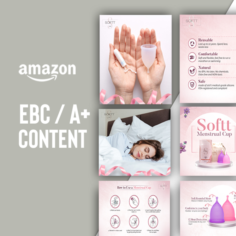
Visual hierarchy is especially important for Amazon designs because it plays a critical role in guiding users through the website and helping them find the information and products they are looking for. With a vast amount of products and categories on the platform, Amazon needs to use a visual hierarchy to prioritize the most important information and make it easily accessible to users.
For example, the search bar and main navigation are typically placed prominently at the top of the page, while product listings and descriptions are given less visual weight and are usually located further down the page. This helps to guide users to the most important information and makes it easy for them to find what they are looking for. Additionally, Amazon uses visual hierarchy to promote certain products and deals. This can be seen through the use of larger images, bolder text, and placement of these products in prime locations on the website. This helps to draw users’ attention to these products and increases the chances that they will be purchased.

The 4 most important things that affect amazon’s visual hierarchy:
- Placement:
The placement of elements on the page can greatly affect visual hierarchy. For example, on Amazon’s website, the search bar and main navigation are typically placed prominently at the top of the page, making them the most prominent elements and guiding users to the most important information.
- Size and Scale:
The size and scale of elements can also affect visual hierarchy. On Amazon, product listings and descriptions are usually given less visual weight than product images and pricing, which are typically larger and more prominently displayed.
- Color:
Color is also an important aspect of visual hierarchy. Amazon’s website often uses bold colors to draw attention to important elements such as calls to action and featured products.
- Contrast:
Contrast can be used to create emphasis and draw attention to important elements. On Amazon’s website, featured products are often displayed with high-contrast images, making them stand out from the surrounding elements.
Overall, these four elements – placement, size and scale, color, and contrast – are key factors in creating a visual hierarchy on Amazon’s designs, which helps to guide users through the platform and prioritize the most important information for them.
Visual hierarchy on amazon designs:
Visual hierarchy in design refers to the arrangement of elements on a page in order of importance, with the most important elements given the most visual weight and attention. This can be achieved through a variety of techniques, such as using larger fonts, bolder colors, or placing elements in strategic locations on the page.
In the context of Amazon’s design, visual hierarchy plays a critical role in guiding users through the website and helping them find the information and products they are looking for. For example, the search bar and main navigation are typically placed prominently at the top of the page, while product listings and descriptions are given less visual weight and are usually located further down the page. This helps to guide users to the most important information and makes it easy for them to find what they are looking for.

Additionally, Amazon uses visual hierarchy to promote certain products and deals. This can be seen through the use of larger images, bolder text, and placement of these products in prime locations on the website. This helps to draw users’ attention to these products and increases the chances that they will be purchased.
Overall, visual hierarchy plays a crucial role in the overall user experience on Amazon’s website and helps to ensure that users can easily find the information and products they are looking for.
FAQS:
What is a visual hierarchy in Amazon designs?
Visual hierarchy refers to the arrangement of elements on a page in terms of importance, with the most important elements being the most prominent and the least important elements being less so. In Amazon designs, visual hierarchy is used to guide users’ attention to the most important information and calls to action.
How does Amazon use visual hierarchy in its designs?
Amazon uses visual hierarchy in its designs to guide users’ attention to the most important elements on the page, such as the search bar, product images, and pricing information. Additionally, Amazon uses color, size, and placement to create a hierarchy of information, making it easy for users to find what they’re looking for.
What are the benefits of using visual hierarchy in Amazon designs?
The benefits of using visual hierarchy in Amazon designs include improved user engagement and increased conversion rates. By guiding users’ attention to the most important elements on the page, visual hierarchy helps users find what they’re looking for more easily, which in turn increases the likelihood that they will make a purchase.
How does visual hierarchy affect user engagement on Amazon?
Visual hierarchy affects user engagement on Amazon by making it easy for users to find what they’re looking for. By guiding users’ attention to the most important elements on the page, visual hierarchy improves the user experience, which in turn increases the likelihood that users will stay on the page longer and engage with more content.

Can you give an example of visual hierarchy in action on the Amazon website?
An example of visual hierarchy in action on the Amazon website is the product detail page. The product image is the most prominent element on the page, followed by the product title and pricing information. Secondary elements, such as customer reviews and product details, are arranged less prominently on the page. Additionally, the “Add to Cart” button is also prominently placed, encouraging user engagement and conversion.


