The role of typography in amazon designs
Typography In Design
Typography is an essential element in the design as it helps to communicate the message and convey the intended tone of the design. It plays a crucial role in creating a hierarchy of information, making the design visually appealing and easy to understand for the audience.
One of the most important aspects of typography in design is legibility. This means that the typeface and font size used should be easy to read, regardless of the medium it’s being viewed on. This helps to ensure that the message is conveyed clearly and effectively to the audience.
Hierarchy in designs:
typography also plays a crucial role in creating a visual hierarchy within a design. This means that the size, weight, and style of the typeface can be used to draw attention to certain elements within the design, making it easy for the audience to understand the most important information.
Furthermore, typography also plays a role in the overall aesthetic of a design. The typeface and font style used can be used to convey a certain tone or mood, such as elegance, fun, or professionalism. This can help to evoke a certain emotional response from the audience and can be used to reinforce the overall message of the design.
In conclusion, typography is important in design because it helps to communicate the message, create a visual hierarchy, and evoke certain emotions. By paying attention to typography, designers can create designs that are easy to understand, visually appealing, and effective at communicating the intended message.

Now let’s dive into the main aspects of typography.
Typography in amazon:
Typography is a critical element in the design of any website or app, and Amazon is no exception. The company’s designers use typography to create a consistent and user-friendly experience for customers across all of its platforms, including the main website, mobile app, and Kindle e-readers.
One of the key ways that Amazon uses typography is to make the shopping experience as easy and intuitive as possible. The company’s designers use clear, legible typefaces that are easy to read on a variety of devices, from desktop computers to smartphones. They also use typography to create a visual hierarchy, with larger types used for headlines and smaller types used for body copy.
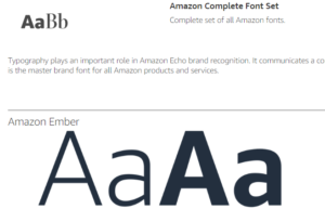
In addition to making the shopping experience easy and intuitive, Amazon’s designers also use typography to create a sense of brand identity. The company’s logo is a simple, clean sans-serif typeface, which is used throughout the website and app to create a consistent visual language. By using a consistent typeface, Amazon can create a sense of familiarity and trust with customers, which helps to build brand loyalty.
Another important aspect of typography on Amazon is the use of typography to create a sense of context. For example, when browsing the site, customers will see different typefaces and types of treatments used depending on the section they are in. For example, in the books section, the typeface will be more elegant and classic, while in the electronics section, the typeface will be more modern and high-tech. This helps to create a sense of context for the customer and makes the shopping experience more engaging and enjoyable.
Typography and customer experience:
Typography plays a crucial role in creating a positive customer experience on a website or app. As stated above, “Typography has psychology all its own, and letters through their shapes communicate extensively. Some of the work done by letterforms results from the shape and tone of the characters themselves, but much is due to subtle associations.” This means that the way the type is presented can affect the customer’s perception and emotions toward the brand and the products being offered.
One way typography helps in customer experience is by making the copy clear, legible and visually appealing to the reader. This means that customers can easily read and understand the information provided, which can help improve their understanding of the products and services being offered. Additionally, the way typography is presented can also evoke specific emotions from customers, such as trust and credibility.
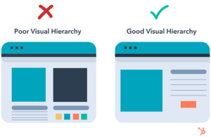
Another way typography helps in customer experience is by creating a strong visual hierarchy. This means that customers can easily navigate and find the information they need on a website or app. A good visual hierarchy can guide customers to the most important information, making it easy for them to find what they are looking for.
do’s and don’ts of typography in amazon:
Do’s:
Use legible and easy-to-read typefaces.
Create a visual hierarchy by using different font sizes and weights for headings and body text.
Use a consistent typography style throughout your design.
Consider the tone and message you want to convey, and choose a typeface that fits that tone.
Use appropriate line spacing and letter spacing to improve readability.
Test your typography on different devices and screen sizes to ensure it looks good and is legible on all platforms.
Use typography to guide the user and guide them through the design.
Take into consideration the audience and the purpose of the design, and choose typography accordingly.

Don’ts:
Don’t use too many different typefaces in one design.
Don’t use overly small or hard-to-read font sizes.
Don’t use typefaces that are too similar, as it can be confusing for the reader.
Don’t use too many different font weights, as it can make the design look cluttered.
Don’t use typefaces that are not appropriate for the design or audience.
Don’t neglect the importance of line spacing and letter spacing.
Don’t ignore the importance of testing your typography on different devices and screen sizes.
Don’t use typography that does not serve a purpose in the design.
By following these guidelines, you can ensure that your typography is legible, visually appealing, and effectively communicates your message. It’s also crucial to keep in mind that typography should be used to enhance the design and communicate effectively with the audience, not to be the main focus or draw attention from the main objective of the design.
Final words:
Typography is a critical element of Amazon’s graphic design. It helps create a consistent, user-friendly experience for customers and a sense of brand identity. It also helps create context and make the shopping experience more engaging and enjoyable. By paying attention to the typography in their designs, Amazon’s designers can create a seamless and enjoyable shopping experience for customers, which ultimately helps to drive sales and increase customer loyalty.
How can we help you?
At design my Amz, we understand the importance of typography in creating a visually appealing and effective design. Our team of experienced designers can help you achieve this by providing expert guidance and services in the areas of typography, layout, and visual hierarchy. We will work closely with you to understand your brand’s message and tone and use that information to choose the appropriate typefaces and font styles for your design. Our team will also help you create a consistent typography style throughout your design, which will help to create a sense of brand identity and build trust with your audience. We will also test your design on different devices and screen sizes to ensure that it looks good and is legible on all platforms. With our help, you can be confident that your design will effectively communicate your message and create a positive user experience for your customers.