


In Amazon’s highly competitive supplement marketplace, brands are not just selling capsules, powders, or gummies. They are selling trust. Many amazon seo experts agree that trust signals now play a critical role in ranking and conversions.
Supplement buyers are making decisions that affect their health and well-being. Because of this, they approach product pages with caution. They question claims, scan visuals closely, and look for signs that a brand is legitimate and reliable.
This creates what many supplement brands struggle with today: a trust gap.
The category is crowded with exaggerated promises, generic packaging, and low-quality listings. As a result, shoppers assume skepticism first and confidence later. On Amazon, where buyers cannot touch or test a product, design becomes the primary signal of quality.
A+ Content plays the same role online that packaging plays on a physical store shelf. If the presentation feels rushed, cluttered, or generic, buyers assume the product is low quality. Premium A+ Content changes this dynamic by allowing supplement brands to communicate credibility, transparency, and professionalism through design.
Why Visual Trust Matters More in Supplements Than Other Categories
Buying supplements is fundamentally different from buying everyday consumer products. A phone accessory or home item carries little personal risk. A supplement does not.
Because of this, supplement buyers rely heavily on visual cues to decide whether a brand feels safe. Before reading ingredient lists or reviews, they ask themselves one silent question: does this brand look trustworthy?
Well-structured layouts, clean spacing, professional typography, and high-quality imagery create a sense of control and care. These visual signals suggest that the brand pays attention to formulation, sourcing, and quality standards.
On the other hand, cluttered graphics, small text, and reused templates raise doubts. Even without realizing it, buyers associate poor design with poor manufacturing.
Premium A+ design helps brands avoid these negative signals and replaces them with clarity and confidence.
Standard A+ vs Premium A+ Content for Supplement Brands
Standard A+ Content is limited in both layout and storytelling. It uses a narrow content width that often feels squeezed into the page. This forces brands to compress important information into small sections, making it harder for buyers to understand the product.
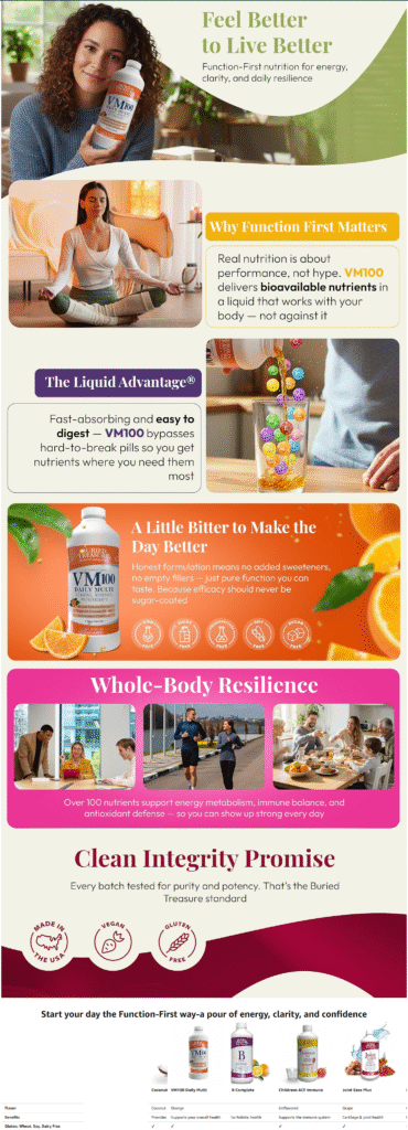
Premium A+ Content expands the layout to a full-width experience. This allows brands to guide shoppers through information step by step instead of overwhelming them all at once.
Why Full-Width Layouts Matter
With Premium A+, supplement brands can:
- Introduce the product with a clear, calming visual
- Separate benefits, ingredients, and education into distinct sections
- Create a flow that feels intentional rather than crowded
This structure mirrors how buyers naturally process information. They want to understand what the product does first, then how it works, and finally why they should trust it.
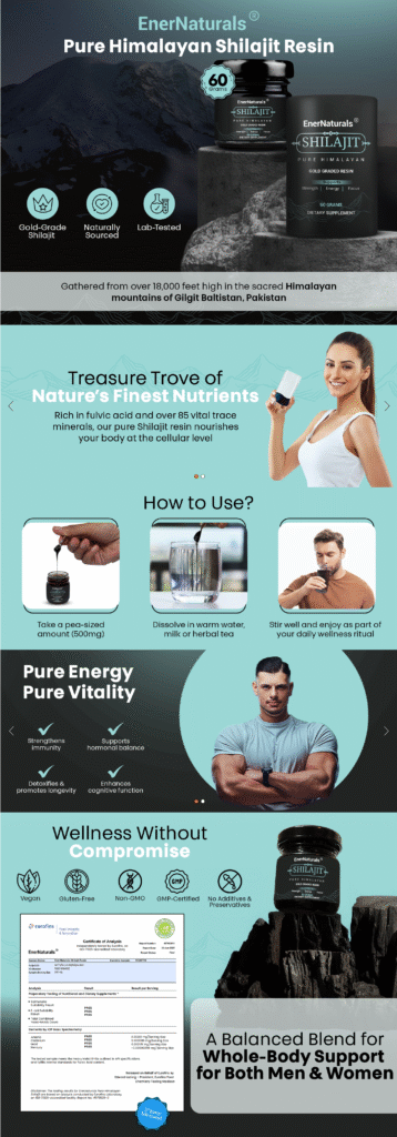
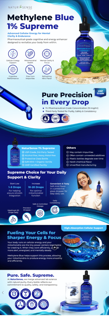
The Five Pillars of Visual Trust in Premium A+ Content for Supplements
Pillar 1: Ingredient Transparency Through Interactive Design
Transparency is one of the strongest trust factors in the supplement category. Buyers want to know what is inside the product and why each ingredient exists.
Premium A+ allows brands to present ingredients visually instead of relying only on dense text. Interactive hotspot modules make this possible.
Rather than overwhelming shoppers with long explanations, brands can show ingredient imagery and allow buyers to explore details at their own pace. This approach feels educational rather than promotional and helps buyers feel informed instead of pressured. When shoppers feel informed, trust increases naturally.
Pillar 2: Clear Typography and Information Hierarchy
One of the most common mistakes in supplement listings is trying to say too much at once. Long paragraphs and crowded bullet points cause buyers to disengage, especially on mobile.
Premium A+ makes it easier to organize information clearly.
Effective layouts follow a simple hierarchy:
- A clear headline that communicates the main benefit
- Supporting text that explains how the benefit is achieved
- Optional detail for buyers who want deeper understanding
Spacing and typography play a critical role here. Clean layouts with room to breathe feel more professional and easier to trust. When a brand does not visually compete for attention, it appears more confident in its product.
Pillar 3: Video as a Trust-Building Tool
Video is one of the most effective ways to reduce uncertainty in supplement purchases. Premium A+ allows video to be placed directly inside the content, where buyers are already focused.
For supplements, video works best when it focuses on clarity rather than hype.
High-performing video formats include:
- Manufacturing or testing environments that show quality control
- Simple lifestyle routines that show how the product fits into daily life
- Texture and mixability demonstrations for powders and gummies
These visuals answer common buyer questions before they are asked. When expectations are clear, confidence increases and returns decrease.
Pillar 4: Social Proof That Feels Real
Supplement purchases are personal. Buyers want reassurance that others have had positive experiences, especially people with similar lifestyles or goals.
Premium A+ allows testimonials to be presented with visual context. Instead of plain text quotes, brands can pair short statements with relevant lifestyle imagery.
This approach feels more relatable and less promotional. It focuses on real experiences rather than exaggerated outcomes, which helps maintain compliance while strengthening emotional connection.
Pillar 5: Comparison Tables That Guide Better Decisions
Many supplement brands offer multiple formulas or variations. Without clear comparison, buyers often feel unsure and delay their purchase.
Premium A+ comparison tables solve this by allowing shoppers to compare products without leaving the page. Clear icons, feature highlights, and visual structure make differences easy to understand.
This not only improves decision-making but also encourages buyers to choose the option that best fits their needs, which often increases average order value.
Why Mobile-First Design Is Essential for Supplement Listings
A large percentage of supplement purchases happen on mobile devices. On smaller screens, poorly designed content becomes difficult to read, which immediately damages trust.
Premium A+ supports mobile-optimized layouts that maintain clarity on phones and tablets. Text remains legible, icons stay clear, and key trust signals do not get lost.
If buyers struggle to read or interpret information, they are unlikely to believe it. Mobile-first design ensures that trust remains intact across all devices.
Communicating Benefits Without Breaking Compliance Rules
The supplement category is tightly regulated. Brands cannot claim to cure, treat, or prevent diseases. This often creates frustration for sellers who feel limited in how they can communicate value.
Premium A+ design helps bridge this gap through visual communication.
Instead of direct claims, brands can use calm imagery, balanced color palettes, and symbolic icons to suggest outcomes like balance, energy, or focus. These visual cues communicate meaning without violating policies.
When done correctly, design becomes a compliant way to express benefits without explicit claims.
The Long-Term Value of Premium A+ Content
Premium A+ Content consistently improves engagement and conversion compared to Standard A+. In the supplement category, where repeat purchases and subscriptions are common, even small improvements in conversion can significantly impact long-term revenue.
High-quality content also improves the efficiency of paid traffic. When shoppers land on a clear, professional listing, more clicks turn into purchases.
Poor design wastes traffic. Strong design compounds its value over time. For supplement brands, Amazon listings are not just product pages. They are the primary way buyers judge credibility.
Portfolio Designs